This was a project I did for MayCreate, spring of 2009, for Allied Arts Annual Report. They wanted something that held their message, conveying what they stood for, and showed their earnings and spending over the past year. The photos were provided to me through an archive of photos from events from Allied Arts. Then entire document was around 30 pages, it was never intended to be printed, but to be shown digitally. Here are a few spreads:

These were logo designs done for Chambliss Shelter, Summer 2009. It was a re-branding project for the home to give them a new logo, letterhead, and revamp their look and feel. These are just a few of the designs that we worked on.

This was another project I worked on through Maycreate, T-shirt Designs done for Southern Powersports. They wanted a heavy type treatment on the back about themselves. These are some designs.

This was a project done in a typography class my junior year. It was an exercise for experimenting with layouts in different types of publications. Here we were given text from Stephan Sagmeister’s series “Things I have learned in my life so far”. We were given the rules of the art magazine Art Journal. We had to use their grid, and font. And among those rules, the photography had to be original and relatively conservative, which spilled into the next project we did for another publication design.

This was a project done in the same typography class as the Art Journal publication project. It was another exercise for experimenting with layouts. The photography had to be simulated from the Art Journal layout photography. Since the magazine was a very modern grunge style design the layout had no specific graph, as you can see through my execution and manipulation of the photo’s.

This was a project done in my Senior Graphic Design Work Shop II in response to the State of the Union Address given this past January. We had free range on what type of “thing” we wanted to create anything from a board game to a poster graphing how many times there was applauses. I tackled it from a public service announcement and touch on a few basic ideas Obama emphasized. Final display was placed into an actual magazine.

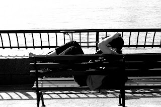
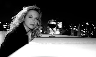
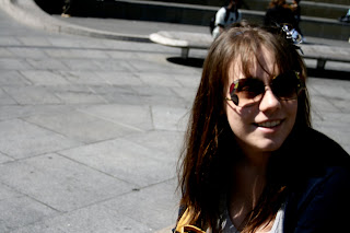
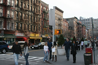
This was a project done in a Photo for Graphic Design class. The initial project was to make a survival kit. Take something like a zombie survival kit, you would find objects necessary to survive a zombie attack; take those things and photograph them in a way to portray the pieces individually like for inventory. Here for this project I chose to do a “social survival kit” where you need closeness and conversation and touch to survive.

TasteBuds was a project we did as a class. Our professor obtained this project through Leadership Chattanooga and Crabtree Farms, who were looking for a campaign to promote local farms and produce. As a class we came up with a logo, colors, print products, and web design. We were divided into groups that then broke the project down into parts. My group was incharge of the ID guide. Obtaining the rules and then designing the grid and layout of the guide. Here are a few pages.


